
Case Study
CriticalPoint Partners
The brief
Our approach
With this thought in mind we developed a new logo that draws inspiration from the Fibonacci sequence, or “the golden ratio”, in order to visualize this idea of taking complex things and turning them into a simple and easy to process thing. From there we created a website that reflects this while also bringing in the concept of “showing the blueprint”.
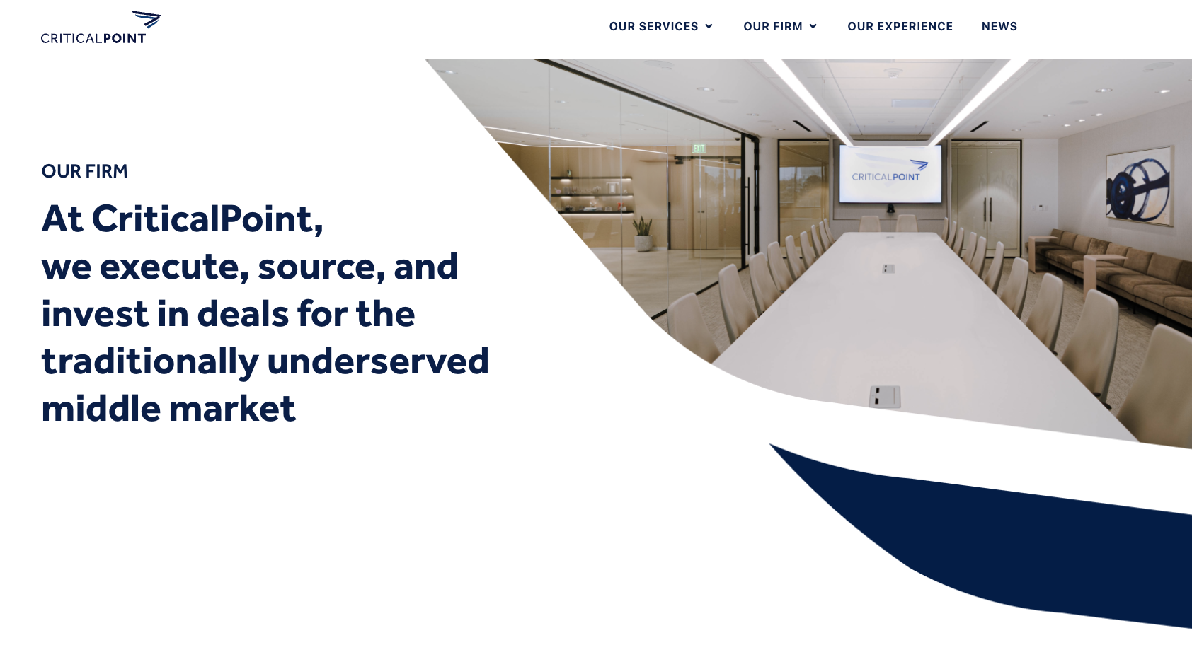
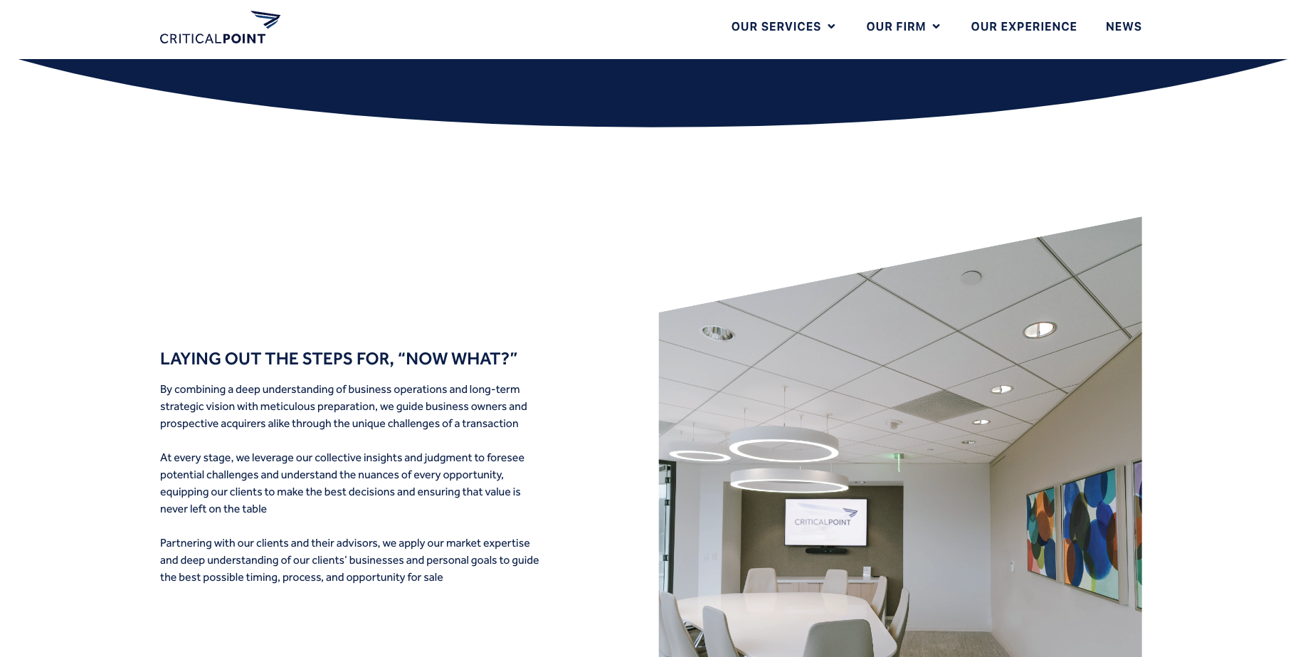
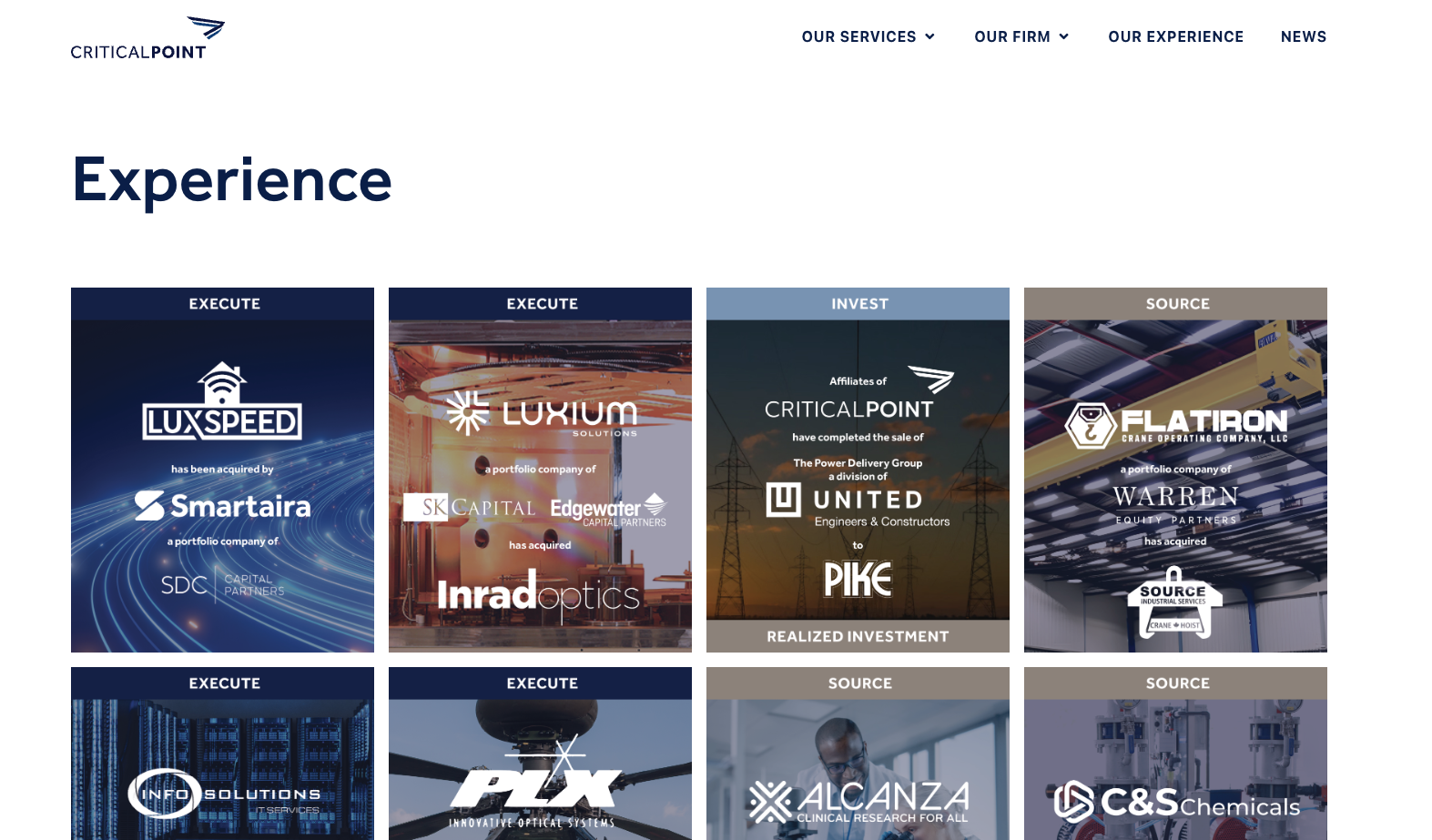
The result
We created a visually stunning website with elegant animations and simplified navigation that elevated the brand identity and refined the user experience. We also applied clearer copywriting, highlighting the expertise of the CriticalPoint offering to ensure users were not only led to the right service but more convincingly. We also created new marketing collateral to tie it all together.
The rebrand featured fresh new marketing decks, social media post templates, stationary, Zoom video backgrounds, and a complete new brand guidelines document.