
Most landing pages read like a committee wrote them.
Why? Because a committee wrote them.
Visitors arrive at your site looking for a clear next step and get a personality quiz. But a landing page is supposed to guide people, not challenge their attention span.
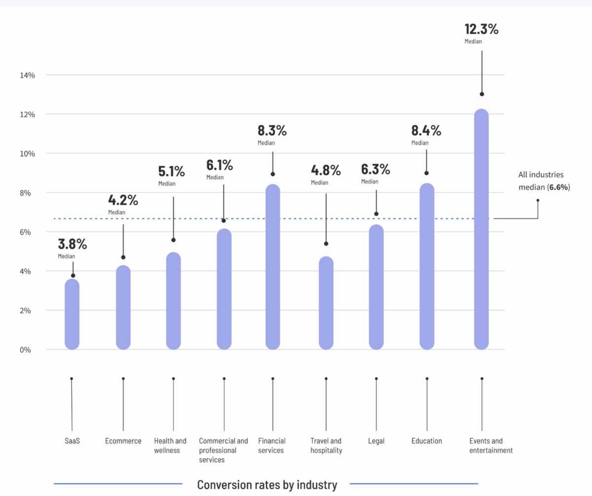
Landing pages quietly do more heavy lifting in financial marketing than most teams realize. The median landing page converts around 6.6 percent of visitors, yet top performers in financial services hit conversion rates of 26 percent or more.
Fintech funnels often land in the 8 to 18 percent range, and a big portion of drop-off comes from added friction within KYC or verification steps. In other words, tiny improvements to clarity, speed, and trust can create outsized gains.
You do not need a dramatic overhaul. You just need to remove the things that slow people down.
Done well, a landing page is the simplest form of storytelling. One audience, one message, one action. Writing one that sells starts with clarity, not creativity. And clarity comes from knowing exactly what the visitor wants before you tell them anything about yourself.
What a landing page is actually for
A landing page is not a homepage. It is not a brochure. It is not the place to explain every feature you worked so hard to launch this year.
Its job is simple. It exists to convince one type of visitor to take one specific action.
People decide within 2.4 seconds whether a page is worth their time. That means the copy must lead with value, not explanation. Instead of starting with what you offer, start with what they get. The more specific and relevant the benefit, the faster the page hooks the reader.
The clear hierarchy rule
Great landing pages feel effortless because they are structured with intention.
Everything above the fold exists to answer one question: is this worth my time?
At the top is a headline that states the immediate value. Beneath that is a subhead that clarifies the benefit. Then comes a clear CTA that tells the visitor what happens next. Supporting visuals reinforce the message and reduce cognitive load.
Below the fold is where detail lives. This is where you expand on benefits, add clarity, and support the offer. Hierarchy helps users move instead of think, and movement is what turns interest into action.
Value first: Lead with what they want
A surprising amount of landing page copy is written from the company’s perspective. The fix is simple. Put the visitor’s goal at the center of the page.
“Download our report” becomes “See how your peers are outperforming the market.”
“Book a demo” becomes “Find out if this cuts 30 minutes off every onboarding call.”
Financial audiences respond to clarity and utility far more than clever phrasing. When the copy is written around what the visitor gains, engagement rises and bounce rates fall.
Removing friction: The silent conversion killer
Friction shows up in places you do not expect, and financial brands accidentally create a lot of it. Here is what causes friction and why it matters.
>> Long, intimidating forms. Because every additional field creates hesitation, and hesitation kills momentum.
>> Vague or generic CTAs. Because visitors rarely click when they cannot predict what happens next, and uncertainty always erodes trust.
>> Compliance text that dominates the page. Because large legal blocks overwhelm users and shift the focus from value to risk.
>> Slow load times. Because visitors interpret speed as competence, and slower pages convert nearly half as well as faster ones.
>> Distracting navigation or too many escape routes. Because the more options a visitor has, the less likely they are to take the one you want.
A friction-free landing page feels like smooth forward motion. When users feel that ease, conversion rates rise naturally.
Compliance safe urgency without hype
Urgency does not have to sound like an infomercial. And in finance, it should not. Urgency can come from relevance or timing without crossing compliance lines. Invitations to get early access, see first results, or understand why the insight matters now encourage action without implying performance. Urgency should help people prioritize, not pressure them into a risky decision.
Trust signals that matter
Financial audiences are naturally cautious, so the right trust signals matter. Client logos, carefully approved testimonials, third party research, and data driven proof points all reduce perceived risk. These elements give visitors confidence that the offer is legitimate and useful. Trust signals work best when positioned near the CTA to reinforce the moment of decision.
The CTA: Where most landing pages fail
One CTA is always better than three. Choice overload kills conversions. The CTA copy should reflect the value of the offer, not the mechanics. Visitors respond better to “Get the guide,” “See the examples,” or “Check improvement areas” than they do to “Submit.” A soft secondary CTA is fine for curious but not ready users, but it should never compete with the primary path.
Check out our CTA guidehere:
The role of AI in landing page copywriting
AI can be incredibly useful for generating variations, clarifying complex statements, or helping teams simplify jargon-heavy benefits. It can also dilute the page if the model is not trained on your strategic narrative. AI writes accurate but generic copy unless you guide it otherwise. But training it with your narrative keeps the voice, framing, and value consistent so the page still sounds like your brand.
The quiet power behind high-converting pages
The landing pages that sell are rarely the flashiest. They are the clearest. They do not try to impress. They try to help. A visitor who understands the value, feels safe, and experiences no friction has no reason to hesitate.
Make the benefit obvious. Make the next step simple. Make the experience human.