
Navigating the intricacies of a website project can pose a significant challenge for busy financial advisors and their teams. The journey has lots of potential pitfalls, including:
- Balancing client meetings and website strategy decisions
- Ensuring regulatory compliance while crafting a compelling online presence
- Selecting the right imagery and content to convey your unique financial expertise
- Lack of personal Design and Copywriting experience to ensure you resonate with your ideal clients
- Keeping up with the ever-evolving digital landscape
These challenges are why many financial advisory firms seek a partner to help bring their vision to life.
But before any of that happens, you’ve got to get inspired!
We’ve handpicked a list of 12 financial advisor websites along with why each site works and some of the design features we love.
Let’s dive in!
1. Abacus Wealth Partners
The Website: California-based Abacus Wealth Partners enjoys an in-house marketing staff, and the website demonstrates thoughtfulness toward building credibility and gives visitors multiple avenues to connect.

Why It Works: The website conveys authority in its regular press mentions also linked on the home page. They also boast a financial archetype quiz, which as a lead-magnet is hard to resist.
Every section is organized perfectly. The blog is up to date. The free financial literacy educational offerings are top-notch, including a separate website with private student-only login.
What We’d Update: Tough call because this website is a well-oiled marketing machine.
While a lead-capture form makes sense at the end of the quiz (and nobody will be surprised by it) we think offering the choice to get quiz results without an opt-in to marketing would exude even more cool factor, and might even bump response. Worth a test.
2. Provence Wealth Management
The Website: With crisp-reading text and short-scrolling page design, Provence Wealth Management Group relates to a financially proficient, high net worth audience that prefers to spend less time reading and more time enjoying life. The hero images are literate and the copy follows suit.
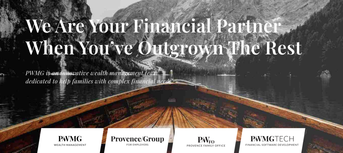
Why It Works: Some financial firms have multiple business pillars. In this case, the website needed to attract HNW individuals, a family office for complex financial situations/legacy planning, and an employer benefits consulting pillar.
This marketing problem is treated by addressing client categories directly after the core brand message.
What We’d Update: At the time of this writing, the Media section had two sub-sections and a single post. From a user experience perspective, clicking links that don’t lead to a full resource may be better left unpublished until its populated with content.
In web design, as in architecture, form follows function.
3. Timothy Financial Counsel
The Website: Timothy Financial Counsel’s site design completely supports the brand mission, conveying an unflagging, distinctive approach to financial guidance.
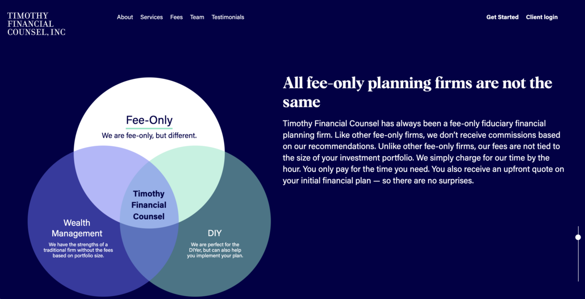
Why It Works: By guiding the readers step-by-step through the core brand message, visitor are prevented from mindlessly scrolling past what this firm is all about. Building a clear pre-qualification tactic into the design is truly brilliant.
Features We Love:
- Elegant look and feel: The homepage maintains a clean, uncomplicated layout.
- Engaging hero section: The “hero” animation seamlessly transitions into interactive graphic elements.
- Professional color scheme: The palette imparts a sense of professionalism and formality, aligning with the brand image.
What We’d Update: Inverted text (light text on a dark background) is fatiguing and causes eye strain. Some visitors may avoid reading without consciously knowing why they don’t want to continue.
4. Humanitas Financial
The Website: Humanitas website is intended to attract Educators, Public Employees, and their families. The design works perfectly for this demographic. The look and feel, images, color palette and messaging harmonize perfectly.

Why It Works: While writing this post, we just happened to catch Humanitas split-testing the hero image on their homepage.
Notice how the pictures above are different but the call to action is exactly the same? If you check out the site, you’ll find each link leads to the same destination.
Split-testing is a way to compare everything from hero images to button text, and gives lots of helpful insight into not only who your audience is but also what design features motivate action more effectively.
Features We Love:
- Sticky navigation: The website features a simple, sticky navigation bar that keeps essential details at the top as visitors scroll, ensuring quicker access to key pages and information.
- Inviting atmosphere: The use of appealing colors and images of smiling individuals and activities creates a welcoming and pleasant atmosphere.
What We’d Update: From a design perspective, the margins on most pages are too wide. This makes for a less comfortable desktop reading experience.
Text formatting is also inconsistent on blog pages, which may be a limitation for off-the-shelf advisor websites.
5. Clark Asset Management
The Website: Taking an “information first” approach, truly thoughtful financial planning is demonstrated in numerous ways throughout this website, from design to response-driving copy.
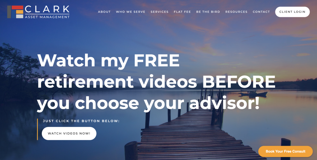
Why It Works: Another website with a very strong point of view and highly effective calls to action. Out of any of the websites we review here, this website sells by selling against other financial planning models.
Features we love:
- Informative education sections: The education section is current and thorough. Books, blogs, and a free video course helps prospects to make well informed decisions.
- Transparent pricing: Not everyone is brave enough to put pricing on the home page. But its a strong move that helps potential clients pre-qualify themselves, and helps refocus the initial meeting on the planning rather than the price.
- Great FAQ page: A comprehensive Frequently Asked Questions page gives easy access to essential information. This one is both informational and functional from a design perspective.
What We’d Update: We can’t even call out margin width on the blog posts. Well done!
6. RLS Wealth Management
The Website: RLS offers a unique high-touch advisory relationship designed to help customers discover their authentic life. It is more of a life coaching system with financial planning as a bonus.
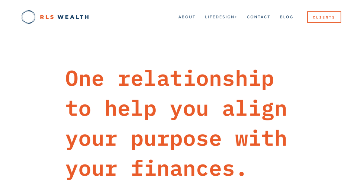
Why It Works: It doesn’t look like a typical financial advisor’s website because RLS offers more than financial planning.
Lots of white space, use of emoji’s in the body copy, and dramatic colors quickly telegraph a message meant for a younger, affluent target audience.
Features We Love:
- Modern look and feel: Despite a straightforward layout, this wealth management website incorporates modern design techniques, including striking imagery and vibrant colors. Very “Apple” and clearly aimed at a similar demographic.
- Distinctive color scheme: The unique, eye-catching palette immediately distinguishes it from other websites in the financial industry.
What We’d Update: There are a few links that don’t explain their purpose on the site or are placed in odd locations.
Making sure people “get” why links are where they are translates to a smoother user experience, which keeps folks on the message and not distracted by the medium.
7. Goldman Sachs 'In The Lead'
The Website: In the Lead is an initiative from Goldman Sachs Private Wealth Management designed to help successful women with wealth management, philanthropy, and legacy planning.
Like our work for Goldman’s launch of Marcus illustrates, even though a brand is institutional doesn’t mean it needs to present like a bank.
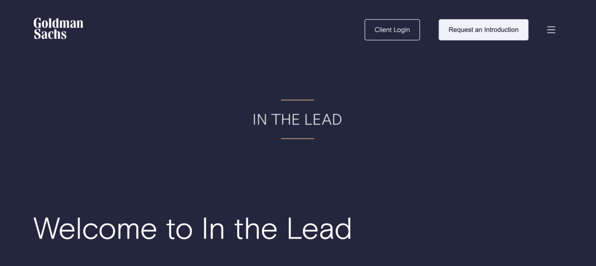
Features We Love:
- By invitation only design: The uncluttered, almost spare environment keeps the focus squarely on the purpose of the initiative and the exclusivity of the service.
- One call to action: The CTA button text “Request an Introduction” prevents any confusion and reinforces the brand feel.
What We’d Update: The carousel of articles doesn’t scroll with mouse or trackpad, you have to locate the three dots below the articles making for a less user friendly experience.
8. UBS Financial Advisors
The Website: Another institutional provider offering tailored advice and investment services. The target audience is clearly identified by the design.

Why It Works: The clean, straightforward design offers lots of white space to relax the eyes and gives a sense of simplicity and clarity.
There is an effective visual hierarchy, with key elements, such as the logo and call to action buttons strategically highlighted in red, drawing attention where it matters most.
What We’d Update: While the website looks and functions beautifully, and UBS does offer M&A advisory, we’d suggest leading with something less niche.
9. oXYgen Financial
The Website: The website stands out with its consistent color palette that emphasises a relaxed approach, inviting us to explore what it might mean to “breathe easier” with financial planning.
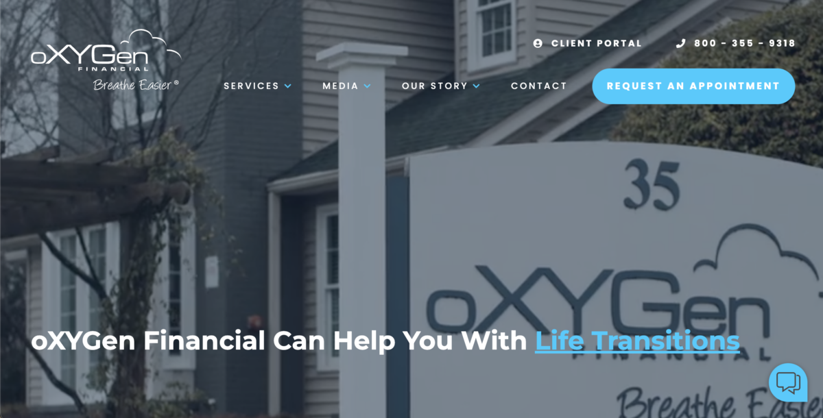
Why It Works: The graphics support the fact that these advisors aren’t afraid to take a different presentation approach, rarely seen in financial advisor websites, including.
- Extensive up-front info offers: Visitors can access free content in the form of market commentary videos, podcasts, white papers, blogs and a weekly newsletter which encourages them to stay on the site and eventually make a consultation appointment.
- Strong value proposition: The design leads visitors from a calming hero video montage, educational offers, mission statement and company video, to a full description of package offerings. The sections are clearly defined and help build confidence.
What We’d Update: Because the eBooks are one of the primary offerings, the page would feel more “finished” with a catalog-style layout, each eBook having an attractive cover and a short description to entice more clicks, and the order form underneath.
10. Bull Moose Retirement Planning
The Website: This uniquely named retirement advisory employs minimalistic design elements, including font usage, picture selection, and iconography, for a clean and uncluttered look.
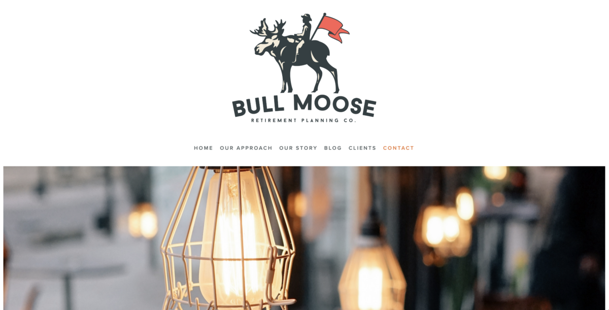
Features We Love:
- Strategic email capture: A strategically placed email capture form near the footer effectively gathers email addresses for the “not boring” newsletter and outreach.
- Clear and convincing offers: Offers are succinct and persuasive, making it easy for visitors to understand the value and benefits.
- Prominent video link: A bold and attention-grabbing video link at the top of the page, featuring enticing titles and vibrant colors, stands out and encourages engagement.
What We’d Update: With such a distinctive brand name, the home page hero image (a series of vintage light bulbs at the time of this writing) might leave people questioning if they’ve landed on the correct site. Hero images your ideal prospect can personally identify with is usually a better way to connect.
11. Financial Synergies Wealth Advisors
The Website: WordPress is our preferred platform for building great financial advisor websites for good reason. Not only can you get an endlessly customizable website, but it is incredibly easy for newcomers to learn the backend.

Why It Works: This WordPress-based site has some great design features including animations and carousel actions that make sense and support the brand message.
The home page scroll is organized to address everything from the brand’s trademarked processes, background, awards and experience, to client testimonials, financial news affiliations and educational offerings to help people get to know them better.
The blogs, weekly market videos, and marketing collateral all maintain a consistent look and feel across the site and assets.
What We’d Update: Another winner. This site checks all the boxes.
12. Cerity Partners
The Website: To With 30 locations across 15 States and over 800 team members, Cerity Partners website has to cut a wide swath to be able to capture attention of HNW individuals and employers, while preventing from seeming impersonal.
Contrast this WordPress site with the previous on our list and you can easily see the versatility of the platform.
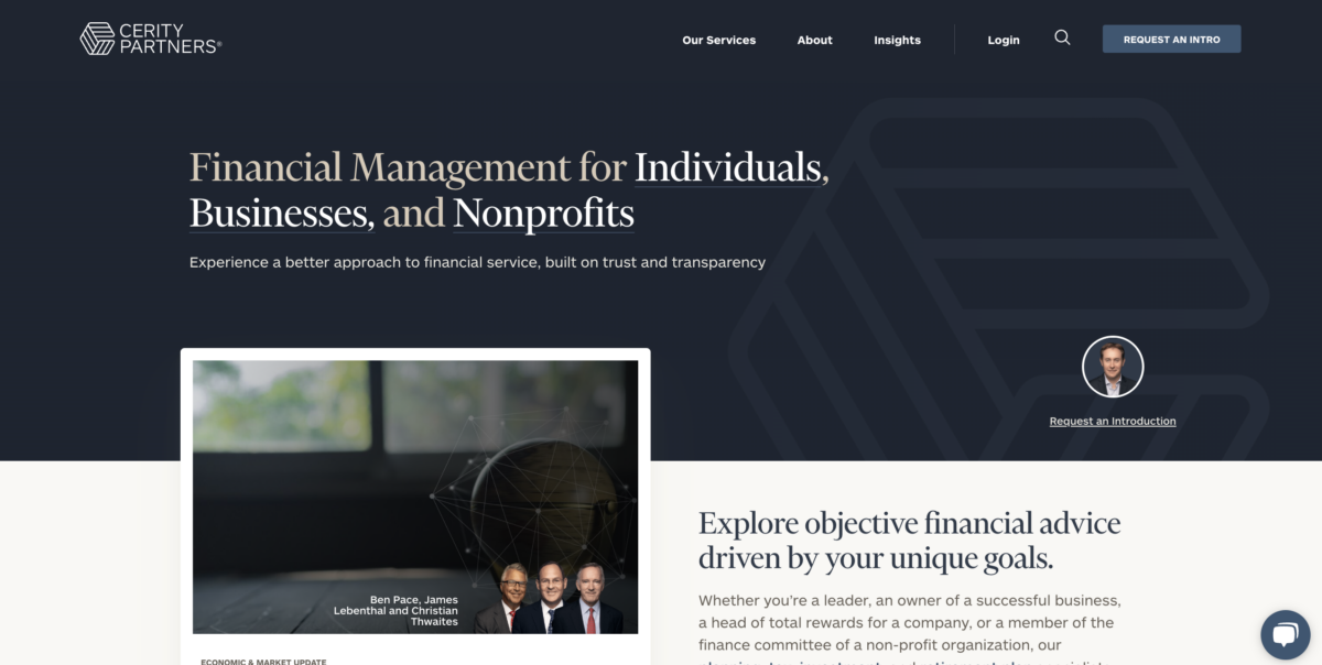
Why It Works: Fact is, most HNW investors are smart enough to manage their own money, they just don’t have time. This website invites serious investors to explore the message as opposed to being overwhelmed by the medium.
This website offers simple navigation, a totally clean and professional look, supported by a ‘typically financial’ color palette.
But before getting to their service model, accomplishments, experience, or much of any direct selling, the website launches straight into information.
With every click a new, strategically-chosen blog post written by an advisor supports whatever section you navigate to. It’s a sophisticated way to say, “We know what we’re talking about, and here’s why ….”
What We’d Update: We caught a single typo on a home-page article post, but otherwise, this site is a winning example for presenting a complex array of services with a very large group of advisors and multiple locations without feeling impersonal.
Get your website right
In the world of financial services, your website is often the first and only impression with your prospects.
A great website can help convey your goals, communicate your uniqueness, and set you apart in a competitive market. Not to mention convert leads into customers.
Whether you’re looking to start a website from scratch or improve an existing one, Finance Studio works exclusively with financial brands to create a website that position you for success in a crowded marketplace.